Items
Contributor is exactly
Anne Mirejovsky is a member of the Crafting Communities team.
-
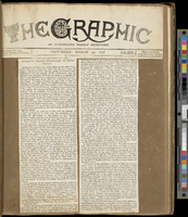
 Frederick Langton’s Scrapbook Frederick W. Langton’s scrapbook was created in the latter part of the nineteenth century, at a time when periodical publications were proliferating. Presented above are selected pages from Langton’s “Ruskiniana” scrapbook, a collection of documents taken from periodicals about the art critic John Ruskin. One page from the album features two typed newspaper columns cut and pasted onto a brown piece of paper. The two columns are carefully placed side by side in the middle of the page, leaving a slight brown gap between them. The newspaper’s masthead is pasted at the top of the page, identifying the source of the typed columns as an issue of “The Graphic” from 30 March 1878. Another album page includes two pages of an article entitled “Art and Its Relation to Life” pasted side by side, with a line of the album’s brown paper separating the two densely printed sheets. A handwritten note pasted in just below these two pages slightly overlaps the article when it is unfolded for reading, as in the photograph included above. Printed text at the top of the note identifies it as a “Memorandum from George Allen, Sunnyside, Orpinton, Kent.” The memorandum is addressed by hand to “Rev. W. M. Richardson, Banbury” and dated 10 July 1877. The memorandum begins, “Dear Sir, In reply to your query about Professor Ruskin and his tea-shop, I beg to inform you that he did put an old servant into a shop… so that the poor in the neighbourhood round about might be able to get pure good tea and coffee.” Another section of the scrapbook emphasizes the variety of materials included in the album: in addition to printed and hand-written materials, Langton included a full pamphlet, “Whistler v. Ruskin: Art & Art Critics,” written by James McNeill Whistler and published on 24 December 1878.
 -
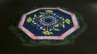
 Hannah Claus's "interlacings" “interlacings,” a looped projected animation, features a red-bordered octagon centred within a black space. Inside the border, concentric rings rotate in different directions, resembling a kaleidoscope as each ring slowly transforms from one pattern to another. The unmoving red octagon frames the animation with intricate Victorian designs accented with white and orange details. While some of the images included here and the video of the piece that is accessible online may look like a decontextualized digital mandala, the work originally existed as an installation. In the gallery, “interlacings” was projected onto the gallery floor and surrounded by a bed of pine needles that dried out over time, alluding to fading memories of the local landscape. Initially, the projection looks uniformly Victorian, bringing to mind the types of designs popularized by William Morris, but as the inner rings shift and patterns morph out from the darkness, they highlight edible plants and flowers native to the Secwepemc territory (Kamloops, BC). For example, the outer ring spins rosehips, root vegetables, and raspberry bushes into bloom, while an inner ring includes roses and berries. These subtle transitions make it seem as though the piece itself is breathing, with greenery expanding out through an inhale and contracting in again through an exhale, but always remaining bound by the confines of the border.
 -
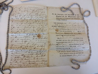
 Mother's Petition to the Foundling Hospital This bundle of folded papers bound together by a white cloth ribbon records fascinating and moving stories: they are petitions completed by nineteenth-century women who applied to have their infants taken in by the London Foundling Hospital, which continues today as the children’s charity Coram (http://www.coram.org.uk). One photograph included here shows the bundle of folded petitions, each petition containing other documents (including letters and reports) relating to an individual application. Additional images of a single, unfolded, sheet of paper filled with typed and written text present the petition of Ann Gidding, a mother who applied to the hospital in 1831. One of these images shows the back of the petition, which documents the outcome of Ann’s application (in this case a rejection as a bribe had been offered), as well as the report from the Hospital Inquirer, who was employed to uncover the character of the applicant. Another image shows the form that all applicants were required to complete, as well as the transcript of Ann’s oral testimony given in front of the all-male governing body as part of the application process. Like the Inquirer’s report, this testimony is reproduced in a mass of cursive penmanship that narrowly escapes spilling off the bottom of the page. Uniform creases produced by the petition’s mode of storage and staining of unknown origin are visible in the images.
 -
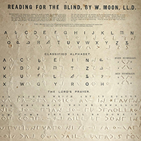
 William Moon's "Reading for the Blind" Primer To a sighted person, this object might appear to be a guide to a foreign but oddly familiar language. It is, instead, an introduction for both blind and sighted users to a tactile script for blind readers created by William Moon. A single sheet of card whose content is shared in both inked and inkless text, the primer has collected creases and weathered brown marks that preserve the touch of those who used it to learn to read. Underneath the bold, black-inked title “Reading for the Blind, by W. Moon, LL.D.” are instructions in small inked print for a sighted assistant, outlining how to teach a blind person to read Moon’s tactile alphabet. Below, an inked version of the roman alphabet is paired with its tactile, raised-print equivalent in Moon’s script. Moving down, we find a reiteration of the pairing of inked and raised-print letters, this version a “Classified Alphabet” that groups letters according to their shape. To the right of this grouping, tactile numerals are grouped as even or odd. Reaching the halfway point of the page, we encounter the Lord’s Prayer presented in Moon’s script. Only the first three of the eleven lines of the prayer are given in both inked and tactile text; the remainder are solely tactile. The lines of the prayer are printed or embossed in two different directions, with lines that read left to right alternating with lines that read right to left.