Items
Subject is exactly
authorship
-
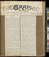 Frederick Langton’s Scrapbook Frederick W. Langton’s scrapbook was created in the latter part of the nineteenth century, at a time when periodical publications were proliferating. Presented above are selected pages from Langton’s “Ruskiniana” scrapbook, a collection of documents taken from periodicals about the art critic John Ruskin. One page from the album features two typed newspaper columns cut and pasted onto a brown piece of paper. The two columns are carefully placed side by side in the middle of the page, leaving a slight brown gap between them. The newspaper’s masthead is pasted at the top of the page, identifying the source of the typed columns as an issue of “The Graphic” from 30 March 1878. Another album page includes two pages of an article entitled “Art and Its Relation to Life” pasted side by side, with a line of the album’s brown paper separating the two densely printed sheets. A handwritten note pasted in just below these two pages slightly overlaps the article when it is unfolded for reading, as in the photograph included above. Printed text at the top of the note identifies it as a “Memorandum from George Allen, Sunnyside, Orpinton, Kent.” The memorandum is addressed by hand to “Rev. W. M. Richardson, Banbury” and dated 10 July 1877. The memorandum begins, “Dear Sir, In reply to your query about Professor Ruskin and his tea-shop, I beg to inform you that he did put an old servant into a shop… so that the poor in the neighbourhood round about might be able to get pure good tea and coffee.” Another section of the scrapbook emphasizes the variety of materials included in the album: in addition to printed and hand-written materials, Langton included a full pamphlet, “Whistler v. Ruskin: Art & Art Critics,” written by James McNeill Whistler and published on 24 December 1878.
 -
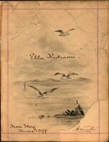 Ella Kidman’s Autograph Album The first page, or “ownership page,” of Ella Kidman’s autograph album features its owner’s name prominently at the centre of its elaborate design. Kidman’s cursive handwriting is framed by a detailed ink drawing of an ocean scene: three seagulls coast above the water, drawing the viewer’s eye to the indication of clouds behind them and to a mountain range on the horizon. A cluster of jagged rocks juts out of the water below the seagulls; beyond this rock formation is a small sailboat. At the bottom left corner of the page are the words “from May. / Xmas 1897.” The album’s paper shows wear from the passage of time; it is wrinkled in places and fully torn at the bottom right corner. Another page of Kidman’s album is decorated with layered rectangular shapes. Framed by these superimposed shapes are the signatures of Kidman’s friends and family. The uppermost rectangle features an illustration of a bundle of flowers lying horizontally on its side; opposite the flowers is a small illustration of a butterfly. In the shape below, two small winged insects decorate the top left corner of the rectangle. A third page shows a skeleton-like shape running the length of the page. The design has been created with black ink and is almost perfectly symmetrical, bisecting the page down the middle. These distinctive shapes are called ink blot signatures or ghost signatures. To create an ink blog signature, album signers would fold the paper over their wet signatures and then re-open the page to reveal their unique ghostly signatures.
 -
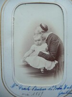 Dinah Craik’s Hidden Mother Portrait In this black-and-white photograph, Dinah Craik embraces her sixteen-month-old adopted daughter, Dorothy. Craik stands beside her daughter, her left hand winding around her waist, while she bends to obscure her own face entirely behind Dorothy’s head. The photograph, which is housed in a private collection, is a portrait of Dorothy, whose gaze is directed at the viewer. Wearing mary jane-style shoes and a white-frilled dress that complements a similar white frill on her mother’s collar, Dorothy sits patiently with her arms relaxed at her sides. All that is visible of Craik herself are her hand, body, and ear, as well as her muted, conventional clothing and a dark band around her hair. Written across the bottom of the white and gold cardboard frame in blue ink are the words “Mrs. Craik l’auteur de John Halifax, Gentleman / mai 1869.”
 -
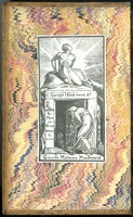 George MacDonald's Copy of "Aids to Reflection" These images come from a copy of Samuel Taylor Coleridge’s "Aids to Reflection" that belonged to Victorian author George MacDonald. One image shows the volume’s title page. This page is yellowed by time and contains a handwritten inscription in black ink in the top right corner to Louisa Powell, along with the date, “Nov. 5. 1847.” Below this inscription and the printed title is a sonnet written in the same script as the name and date. The first few letters of each line of the sonnet are obscured by the crease of the page. Other images show the black-and-white bookplate, bearing the name of “Greville Matheson MacDonald” and set against colourful marbled paper. The illustration on the bookplate depicts two figures, a muscular young man sitting atop a cavernous entryway shrouded in darkness, and another man, stooped with age, carrying a cane, and walking across the threshold of the same entrance. The darkness of the entryway contrasts with light emitting from the young man. The lintel of the cave bears the text “Corage! God mend al!” while the left post bears an image of a hand holding up a cross and the Latin text “per mare per terras domum tu erras” (“through sea and through land, you wander homeward”). At the bottom left-hand corner of the doorway is a Latin epsilon followed by the text “x Libris.” The book is currently held at the Armstrong Browning Library and Museum at Baylor University as part of their George MacDonald collection. The inscription (as transcribed by Dr. Denae Dyck and Dr. Melinda Creech) reads as follows: [?Whether] this day on earth shall often be, [?I h]ave no wish that I can make for thee. [?Nor] will I wish thee ever cloudless years. [?Why] wish thee that which cannot be, I know [?That] as the sun must shine, so clouds must grow. [?And] as our being is, so are our tears: [?And] one who hath given thanks for sorrow’s hour [?May] never pray thou shouldst not know its power; [?Ye]t there is one thing I can wish for thee – [?That] the unbounded promise may be thine [?When] all things in one Providence combine [?So]rrows and joys in glorious unity – [?But] bright or dark, unknown or understood, [?All] things work together for thy good.
 -
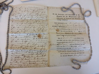 Mother's Petition to the Foundling Hospital This bundle of folded papers bound together by a white cloth ribbon records fascinating and moving stories: they are petitions completed by nineteenth-century women who applied to have their infants taken in by the London Foundling Hospital, which continues today as the children’s charity Coram (http://www.coram.org.uk). One photograph included here shows the bundle of folded petitions, each petition containing other documents (including letters and reports) relating to an individual application. Additional images of a single, unfolded, sheet of paper filled with typed and written text present the petition of Ann Gidding, a mother who applied to the hospital in 1831. One of these images shows the back of the petition, which documents the outcome of Ann’s application (in this case a rejection as a bribe had been offered), as well as the report from the Hospital Inquirer, who was employed to uncover the character of the applicant. Another image shows the form that all applicants were required to complete, as well as the transcript of Ann’s oral testimony given in front of the all-male governing body as part of the application process. Like the Inquirer’s report, this testimony is reproduced in a mass of cursive penmanship that narrowly escapes spilling off the bottom of the page. Uniform creases produced by the petition’s mode of storage and staining of unknown origin are visible in the images.
 -
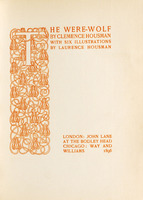 Clemence Housman's "The Were-Wolf" Clemence Housman’s "The Were-Wolf" is an illustrated novella published in 1896. Housman wrote the story and engraved the six illustrations, which were designed by her brother Laurence. The title page, printed in orange ink, acknowledges Clemence Housman as the author and Laurence Housman as the illustrator, as well as the novella’s publication date and its publishers in London and Chicago (John Lane and Way and Williams, respectively). However, as often happens in Victorian illustrated books, Clemence Housman’s role as the wood engraver remains unacknowledged. The engraved full-page illustration included here, “Rol’s Worship,” shows three young men working at a table; a small child hangs on to the legs of the man on the left. The background includes two women, partly obscured by the figures in the foreground. The various textures of wooden flooring, human skin, and fabric are represented by patterns of wood-engraved cross-hatched lines. Denser hatching suggests shadow on the ceiling and floor; white space and lighter patterns of lines show where backlighting brightens the scene. In the bottom left corner, Laurence Housman’s initials appear in block capitals. The complete, rectangular image is framed by white space but not centred on the page, leaving a greater amount of blank paper below and to the right of the illustration.
 -
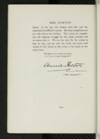 Mrs. Alexander's Mark This page is from "Women Novelists of Queen Victoria’s Reign: A Book of Appreciations," published in London by Hurst and Blackett in 1897. It features standard black letter text on white paper. In addition to the body text, the page features three women’s names. First, “Mrs. Norton,” the subject of this chapter, runs across the top of the page. Second, the signature of “Annie Hector” appears directly under the body text at the centre of the page, underscored by a jagged flourish. Lastly, the name “Mrs. Alexander” appears inside both quotation marks and parentheses. Though the last name is in capital letters, its font is noticeably smaller than the two other names and somewhat smaller than the body text. The page number appears in parentheses at the bottom of the page. The body text of the page reads: labour. In her day, the workers were few, and the employers less difficult to please. But these comparisons are not only odious, but fruitless. The crowd, the competitions, the desperate struggle for life, exists, increases, and we cannot alter it. We can but train for the contest as best we may, and say with the lovely and sorely tried subject of this sketch, as she writes in her poem to her absent boys: “Though my lot be hard and lonely, Yet I hope – I hope through all.” The copy of the book featured here is housed at the University of Toronto’s Robarts Library.
 -
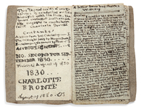 Charlotte Brontё’s “Little Book” This “little book” by Charlotte Brontë contains an edition of "The Young Men’s Magazine," created in 1813 when Charlotte was just 14 years old. The size of a matchbox, the book features neat but cramped handwriting in black ink. The left-hand side of the left page lists the book’s contents with titles and corresponding page numbers. Below the contents, the year 1830 and the author’s name in all capital letters appear prominently across the bottom third of the page. The date of August 19 1830 runs across the bottom of the page followed by the initials CB. The right page has a title that corresponds to the first entry in the table of contents on the facing page and is filled with small, indeed barely legible, text.
 -
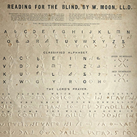 William Moon's "Reading for the Blind" Primer To a sighted person, this object might appear to be a guide to a foreign but oddly familiar language. It is, instead, an introduction for both blind and sighted users to a tactile script for blind readers created by William Moon. A single sheet of card whose content is shared in both inked and inkless text, the primer has collected creases and weathered brown marks that preserve the touch of those who used it to learn to read. Underneath the bold, black-inked title “Reading for the Blind, by W. Moon, LL.D.” are instructions in small inked print for a sighted assistant, outlining how to teach a blind person to read Moon’s tactile alphabet. Below, an inked version of the roman alphabet is paired with its tactile, raised-print equivalent in Moon’s script. Moving down, we find a reiteration of the pairing of inked and raised-print letters, this version a “Classified Alphabet” that groups letters according to their shape. To the right of this grouping, tactile numerals are grouped as even or odd. Reaching the halfway point of the page, we encounter the Lord’s Prayer presented in Moon’s script. Only the first three of the eleven lines of the prayer are given in both inked and tactile text; the remainder are solely tactile. The lines of the prayer are printed or embossed in two different directions, with lines that read left to right alternating with lines that read right to left.