William Moon's "Reading for the Blind" Primer
Item
-
Title
-
William Moon's "Reading for the Blind" Primer
-
Description
-
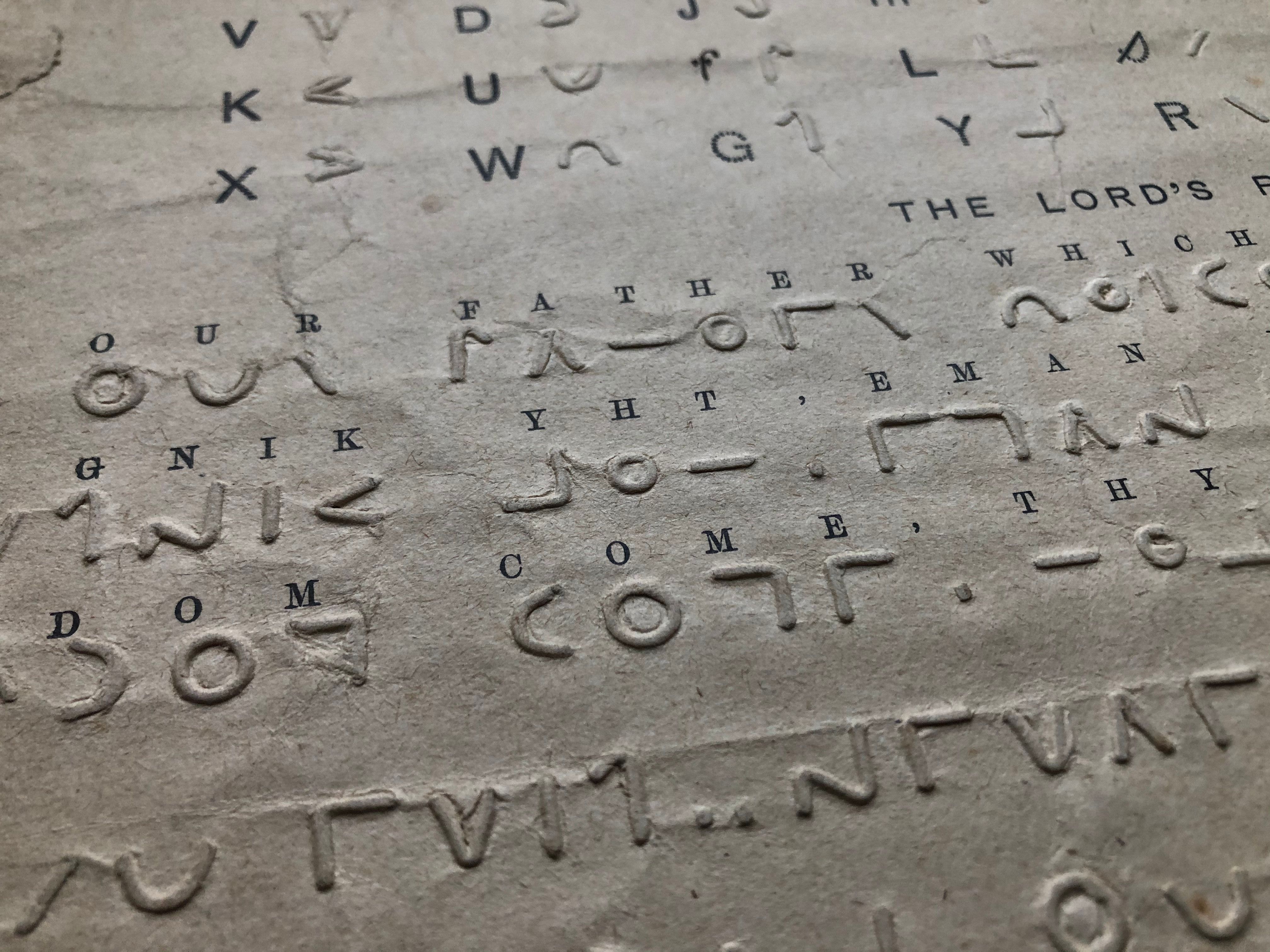
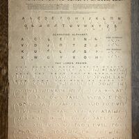
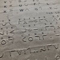
To a sighted person, this object might appear to be a guide to a foreign but oddly familiar language. It is, instead, an introduction for both blind and sighted users to a tactile script for blind readers created by William Moon. A single sheet of card whose content is shared in both inked and inkless text, the primer has collected creases and weathered brown marks that preserve the touch of those who used it to learn to read. Underneath the bold, black-inked title “Reading for the Blind, by W. Moon, LL.D.” are instructions in small inked print for a sighted assistant, outlining how to teach a blind person to read Moon’s tactile alphabet. Below, an inked version of the roman alphabet is paired with its tactile, raised-print equivalent in Moon’s script. Moving down, we find a reiteration of the pairing of inked and raised-print letters, this version a “Classified Alphabet” that groups letters according to their shape. To the right of this grouping, tactile numerals are grouped as even or odd. Reaching the halfway point of the page, we encounter the Lord’s Prayer presented in Moon’s script. Only the first three of the eleven lines of the prayer are given in both inked and tactile text; the remainder are solely tactile. The lines of the prayer are printed or embossed in two different directions, with lines that read left to right alternating with lines that read right to left.
-
VANESSA WARNE ON WHAT THIS OBJECT TEACHES US:
William Moon’s raised-print alphabet primer is more than a tool for learning to read a tactile script. It symbolizes a history of efforts to accommodate blind readers, efforts led by blind activists who challenged ideas about ability and literacy, class boundaries, and conventions of printing and bookmaking.
Dr. Warne explains that William Moon advertised his script as more tactile than raised-print rivals proposed for blind people’s use. Moon, who became blind in 1840, designed his script with the needs and preferences of blind people in mind, including working-class blind people. Moon was concerned about the accessibility of existing scripts for blind labourers, such as basket weavers, whose calloused fingers had limited sensitivity. When Moon began to promote his script in 1845, he described it as “so palpable that it could be read by a gloved hand.”
Dr. Warne emphasizes the uniqueness of Moon’s script, explaining that he considered the needs of the blind community from his position as a middle-class person with acquired blindness. Moon based his script on the shapes of the Latin (or Roman) alphabet used by sighted people to read and write English. In doing so, Moon linked tactile and inked scripts, allowing those learning to read his script by touch to engage their memories of the shapes of inked letters. This similarity to inked text also helped sighted assistants to learn Moon’s script, aiding both sighted assistants’ and blind students’ comprehension.
Moon’s script employs seven basic shapes, which are rotated to form the 26 letters of the alphabet. Though Moon based many features of his tactile script on the inked Latin alphabet, Dr. Warne points out Moon's “radical” choice to alternate the reading directions of lines from left to right and right to left, an arrangement known as boustrophedon. Moon believed this break with convention allowed his tactile text to be read more easily and efficiently by blind readers who were guided to the next line of text by a bracket-like raised shape and did not have to locate the start of a new line across the page. As this change signals, Moon was not afraid to challenge conventions, even those “as ingrained as the reading direction of English.”
Though braille ultimately became the dominant tactile script of blind readers, Moon published thousands of books in his script and reached many readers, including working-class readers, with his work. Dr. Warne notes that “it was not uncommon for [blind] readers to compare their ability to read by touch to a cure for blindness.” While Moon’s script is no longer in use, his work pushes us to question the “ocularcentrism” of ink-print alphabets, of book design and of scholarly practices such as digitization, “inviting us to touch so that we can learn.”
-
Rights Holder
-
Private collection